As experienced designers, we love a good, clean look and feel – but that’s not where our job ends.
Good design enhances, improves, and amplifies good communication.
Why should you care?
Because the better your organization can communicate, the more donors, volunteers, and resources you can acquire for your community foundation, equity-focused foundation, private foundation, corporate foundation, or nonprofit.
Let’s look at some specific examples of how good design and communication work together!
Design and communication work together to enhance transparency
Transparency isn’t just a buzzword—it’s an absolute requirement for your foundation or nonprofit.
Your existing donors and potential donors are more discerning than ever, and if your foundation or nonprofit isn’t actively focusing on being transparent about what you do, who you serve, and where your resources go… it’s going to be hard to continue attracting the support you need.
Complicated numbers and data can, unfortunately, be used to hide or mask what a foundation is doing with their resources. Even if you’re not trying to be secretive about your results and spending—complex, hard-to-read data will leave people thinking you have something to hide.
This is where good design is a must.
At Acton Circle, we simplify the complex and make data easy (and engaging) for your audience.
Great infographics and strategic design give you the power to highlight your results and be 100% transparent about how you’re stewarding your resources.
This builds massive trust and respect with potential donors, volunteers, and communities.
We can highlight your transparency in a number of deliverables, including:
- Case statements
- Email newsletters
- Canva templates
- Annual reports
Good design leads to better storytelling
Storytelling is one of the best ways to engage your current and potential donors with your mission and vision.
And while yes, your messaging matters, strategic graphics and intentional visuals are the fastest, most reliable way to tell your story in a way people care about and connect with.
According to a study done by the Social Science Research Network (SSRN):
Readers retained 65% of the information shared in an infographic 3 days after viewing it compared to only 10% retention of text-only information.
If you want readers to understand, connect with, and remember your story—infographics are your best option.
Let’s use social media as an example.
You can share a photo of a child participating in a community program your foundation organized and write a caption that describes the program, talks about how many children participated, and sums up the experience.
That’s a good post.
But if you want to really connect with more Instagram users (with increasingly shorter attention spans), you’ll pair that caption with a collection of intentional infographics that sum up the impact of the program in powerful images that can be seen and understood in mere seconds.
The same holds true for any number of marketing tools and professional communication—from your foundation or nonprofit’s website to your email newsletters, event invitations, and annual reports.
Good design elevates your storytelling and engages more of your audience.
Design impacts accessibility
Written communication on its own can be unintentionally limiting and inaccessible, depending on where and how it is shared.
Strategic design is one of the most effective ways to make your communication more accessible to a number of audiences.
Non-designers often use font colors or options that are challenging to read on screens for a number of people, while an experienced designer will always prioritize using high-contrast, readable fonts.
At Acton Circle, we’re always focused on accessibility. We improve the accessibility of our clients’ brand materials by adjusting color contrast or font sizing for documents—for readers who may be unable to read certain text or see photos and graphics.
Great design also overcomes language barriers and other literary challenges by creating easy-to-understand symbols and icons that sum up or describe written text.
Designing with sufficient negative space helps your reader focus on the words without being distracted or overwhelmed by huge chunks of text or confusing layouts.
Good design and communication are essential for your nonprofit or foundation
You’re not communicating if no one understands your message.
Confusing, unclear communication can happen in a number of ways:
- Complicated numbers or complex data
- Use of industry jargon or specialty terms
- Too much text in one space
- Language barriers or differences
- Communicating with individuals with visual impairments, literacy challenges, or neurodiverse brains
- Rambling or stream-of-consciousness type messaging
The benefit of smart design is that it overcomes all of these challenges and makes it easier for almost anyone to understand your message.
Good design makes your communication more transparent, more accessible, and more engaging.
Clearly, it’s not just about looking good. (Although we do that, too!)
Want to put good design and communication to work for your nonprofit or foundation?
At Acton Circle, we’re committed to helping you communicate more clearly and effectively with your current and potential donors and community members.
We’re here to help amplify your message so you can serve more people and help more communities.
We believe that the world is a better place because of your work, and our job is to help you share the power of what you’re doing with more people through smart, strategic design.
If you’re ready to give your communication the good design edge it needs, we would love to chat!
.avif)
Get The Annual Report Checkpoint

The Belief-Building Annual Report Playbook
Enter your info and we’ll send the postcards straight to your inbox:

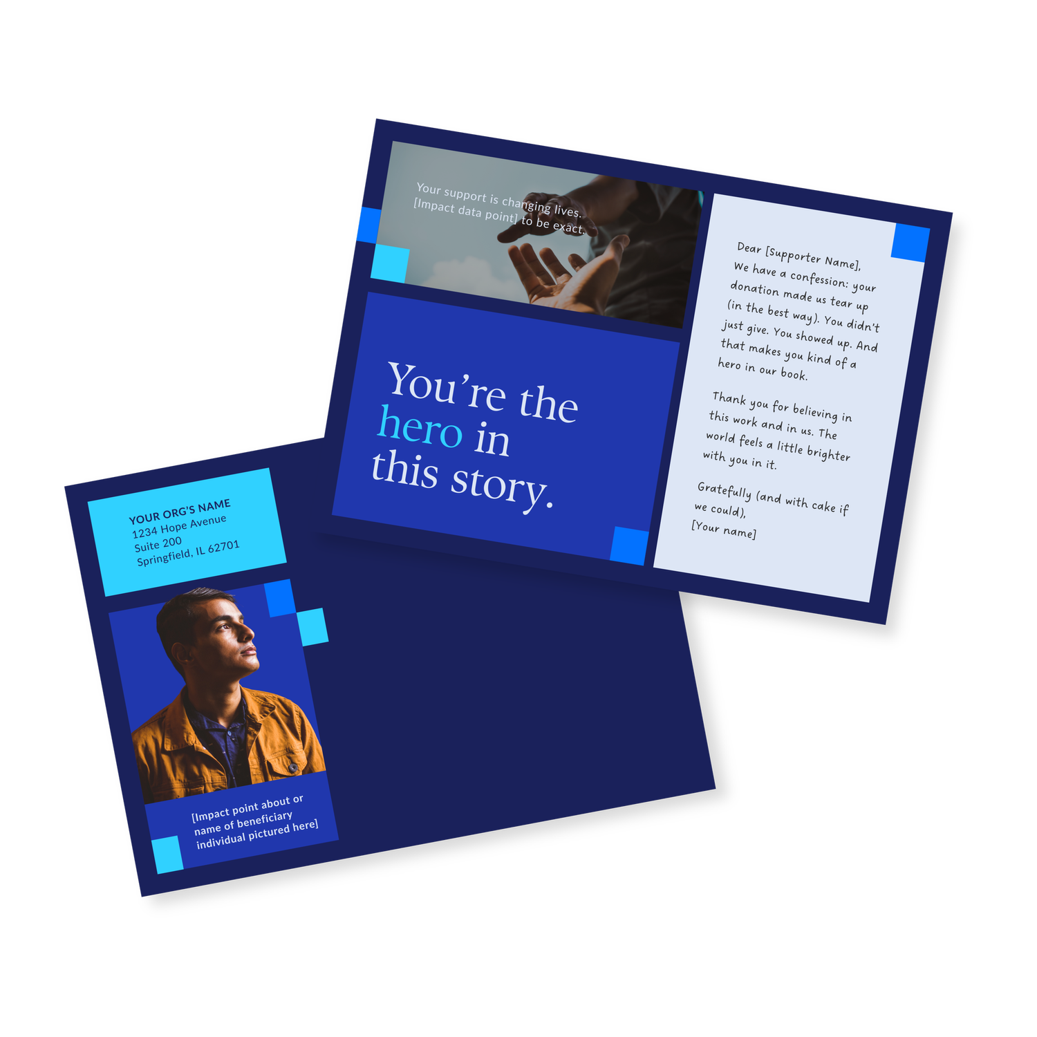
Donor Thank You Postcards Templates
Enter your info and we’ll send the postcards straight to your inbox:

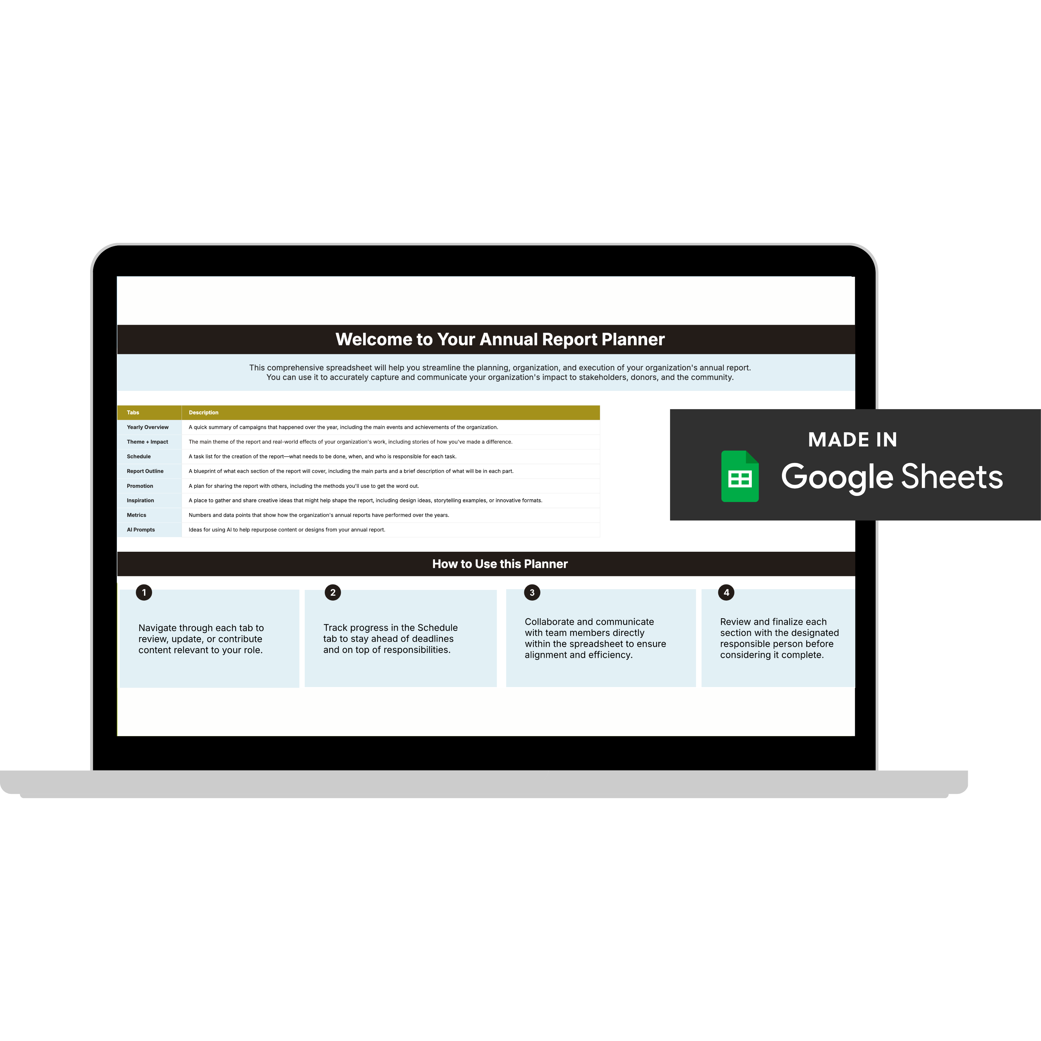
Annual Report Planner
Get a clear content roadmap so your annual report builds belief, earns trust, and actually gets used after launch—plus the same planning approach we use with our 1:1 clients, built in.


