An Impact Report That Finally Looks Like the Org They Are Today

Written by

Olivia Wheeler

/

Updated

November 16, 2026

Every nonprofit goes through this. You invest time and money in a brand refresh that takes your org identity to a new level. It looks great, and it finally reflects the org you are today.

A few months later, your annual impact report goes out… and it looks like no refresh ever happened.

Launching a brand refresh and truly implementing it are two separate things. Annual reports are usually the most time- and resource-consuming asset in a nonprofit's comms kit, so it's always the first to get sacrificed and the last to get caught up.

This was true for Scholarship America. The brand refresh came two years ago (and it was great!). But their impact report was still living in the old version of the org.
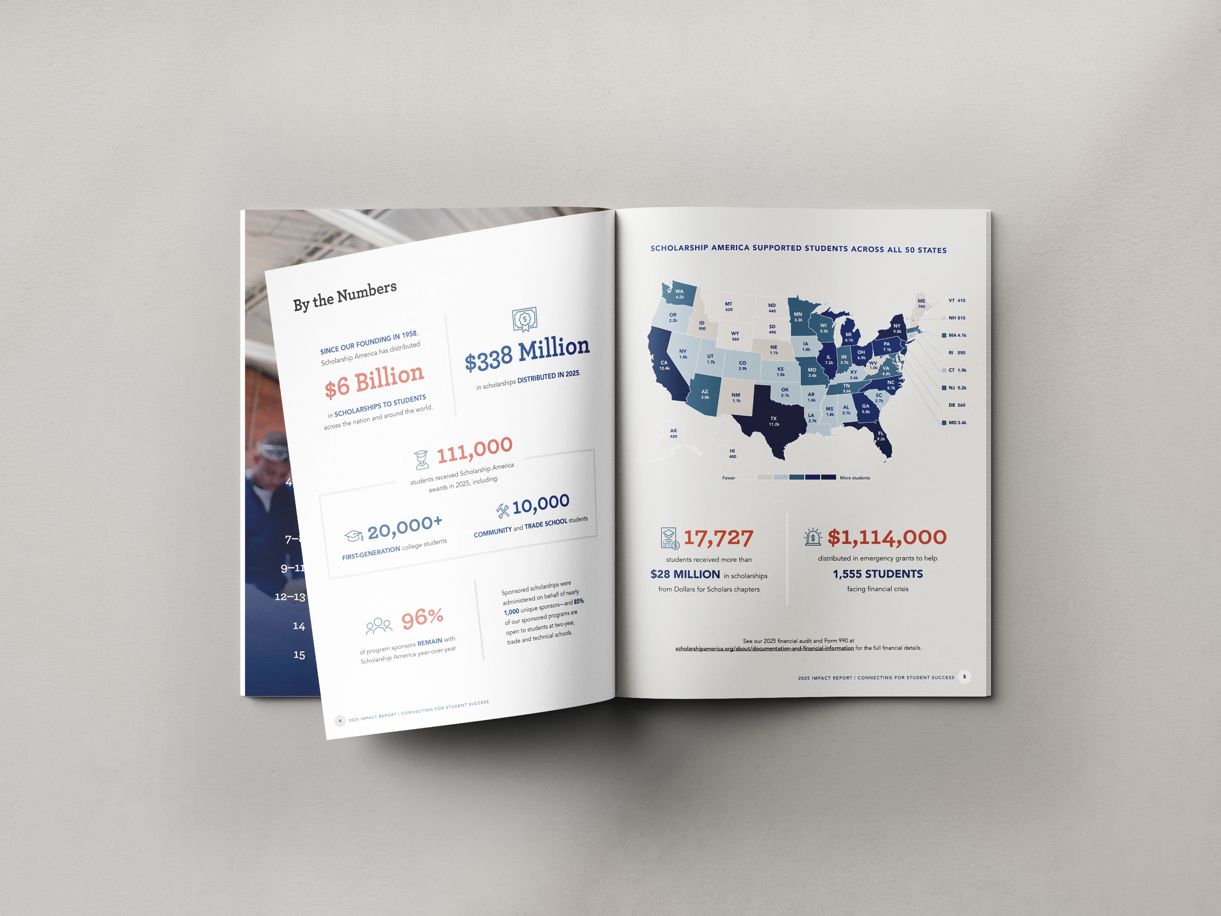
By the Numbers spread from Scholarship America's 2025 Impact Report, designed by Acton Circle

A Primary Stewardship Piece Lagging Behind

Scholarship America is a national nonprofit that removes financial barriers to post-secondary education. They fund scholarships and emergency aid for students who need them most: first-generation students, students facing unexpected financial crises, and students whose paths don't look like a traditional four-year track.

About two years before this project, they completed a brand refresh across their website and core materials. Everything looked great and new, but one piece hadn't caught up: their impact report.

The content they had lived in an 18-page Word doc, and the previous year's report didn't reflect the level the brand had reached.

Beyond the visuals, Scholarship America also wanted their impact report to jump-start their renewed stewardship strategy.

They partner with corporations, foundations, individual donors, and roughly 400 local Dollars for Scholars chapters. And historically, communications had centered on sponsors. Now, they wanted all donors (from a one-time $5 gift to a $50,000 annual commitment) to have an equally strong experience.
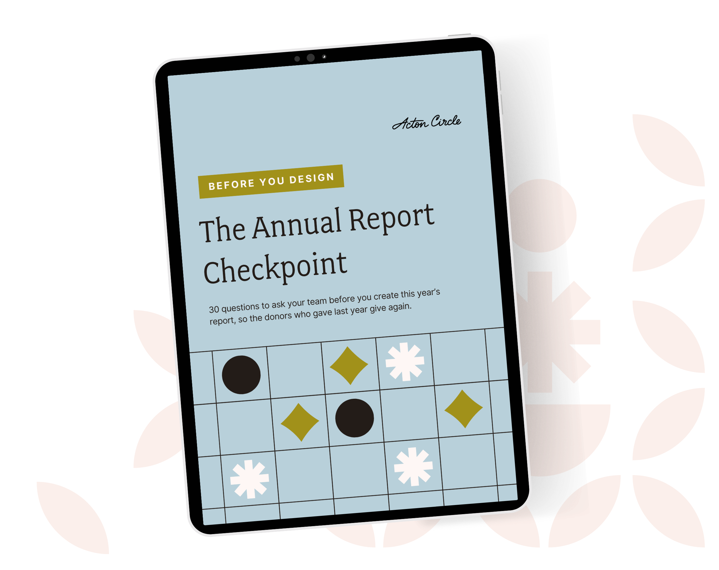
Ipad on a green floral background displaying an image of a blue, patterned PDF

Get The Annual Report Checkpoint

What Was Getting in the Way

There was pressure to get it right and no bandwidth to build it in-house. The team needed a partner who could take an 18-page Word doc, a brand guide, and a folder of photos and turn it into something that makes a 200-person organization feel human.

And they needed it done in less than a month.

The design needed to:

  • Move the tone from corporate and buttoned-up toward warm, emotional, and nonprofit-first
  • Make a $500 donor feel as much a part of student outcomes as a Fortune 500 sponsor
  • Turn various stats into an impact section donors would truly read
  • Show the full breadth of students served: different ages, majors, and paths, including veterans
  • Work as a foundation the team could repurpose into year-end emails, social posts, and year-over-year comparisons

The project sat with a four-person marketing team, led by a manager taking on the impact report for the first time. Three internal reviewers, including the Chief Growth Officer, would weigh in at every round, and the board was expecting to see a finished draft in three weeks.
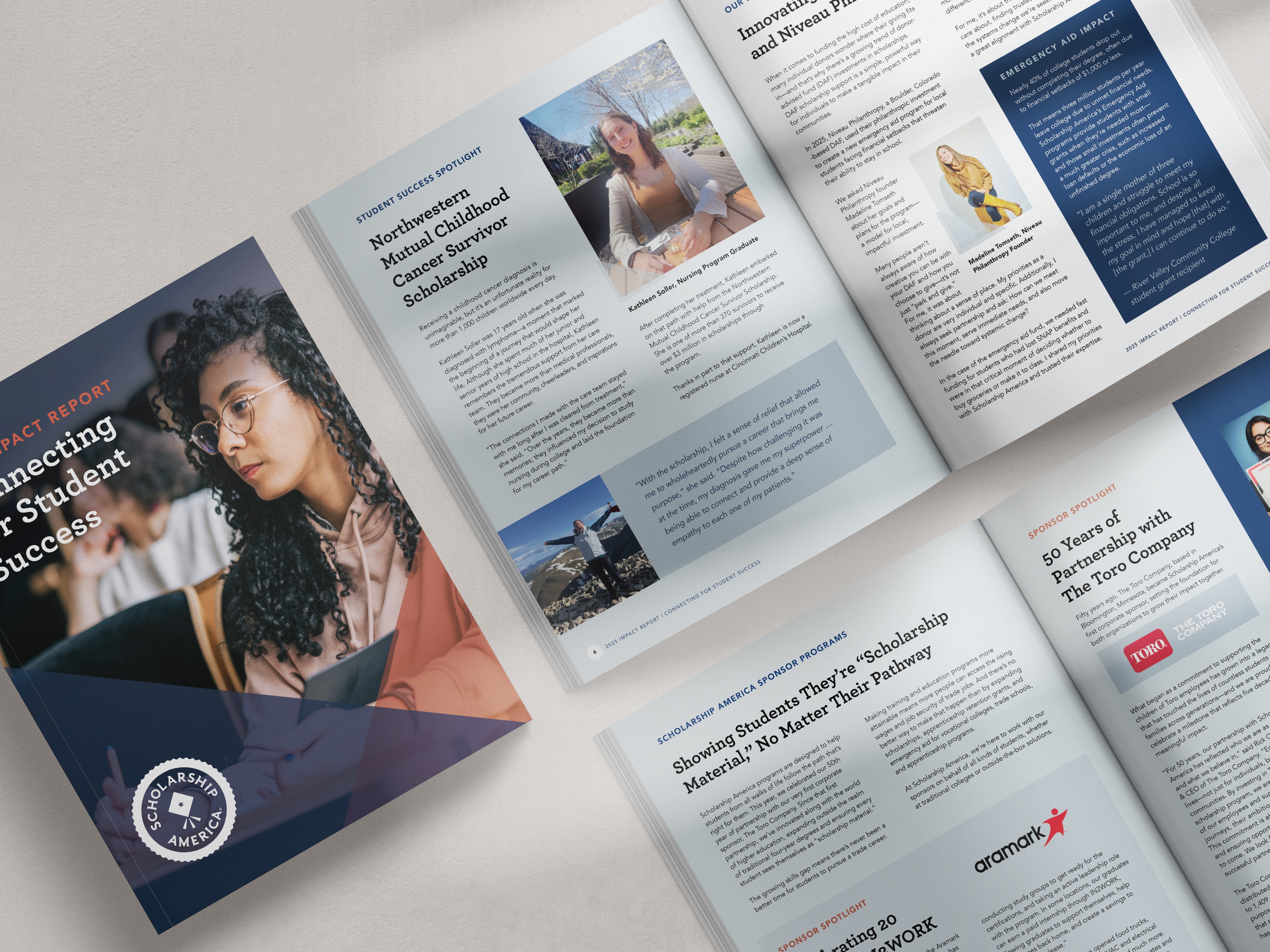
Scholarship America's 2025 Impact Report, cover and spreads, designed by Acton Circle

One Piece to Pivot an Entire Stewardship Direction

We designed the impact report to finally reflect the organization's updated identity and be the primary stewardship tool of the year.

The process moved from wireframe to sample spreads to full design, with feedback rounds at each stage. The team was never reviewing something they hadn't already shaped.

The most transformative inclusions are:

  • A bolder cover page that drew in donors and supporters at first glance
  • A data-led spread pulling stats from across the org into one digestible view, with a state-by-state impact map
  • Editorial double-page treatments to reflect the range of students Scholarship America serves
  • Direct impact stories that include specific moments to show what donor dollars can truly do
  • Print and digital files delivered for both board presentation and online distribution

Their report went from being a compliance document that existed with the old version of their identity to a stewardship tool that speaks to every donor.

Working from the refreshed brand system, we created the 16-page piece to read like a thank-you letter and hold up like an institutional document.

Donors of every size get a clear picture of what their giving produced. Leadership got a board-ready report on schedule. And the marketing team got a piece they were proud to send out and a template they can build from next year instead of starting over.
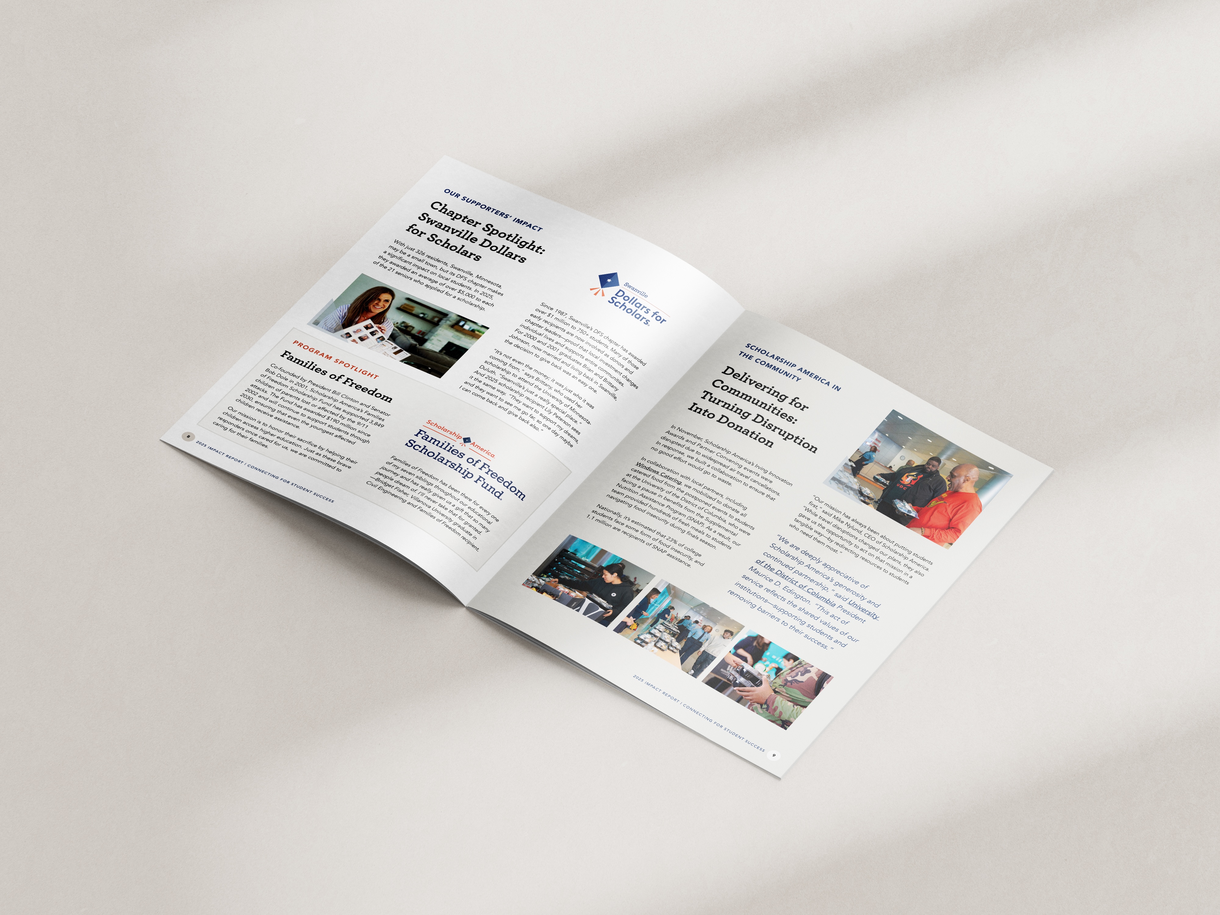
Story-first editorial spreads from Scholarship America's 2025 Impact Report, designed by Acton Circle

Turn Your Report Into a "Thank You" That Donors Can Feel

Rolling out the brand refresh is planting the seed. Reaping the fruits is seeing that improved system breathe new life into all your materials.

If you need to build a donor-ready report that honors your identity and builds recognition, book a call and let's talk it through.

See the full project in our portfolio: Scholarship America

Monthly Design Workshop

If you’re the one who usually handles design at your org, this is meant for you. You’ll leave with useful design tips you can start using right away.

see upcoming sessions
👋🏽 Hi, I'm Krista Reyes

I'm a writer and editor with almost a decade of professional experience. I spent most of my formative years working with local and international nonprofits, channeling my passion for worthy causes into written works with depth, value, and intention.

If I'm not working, you'll find me reading books, watching movies, playing chess, or bonding with my four dogs.

👋🏽 Hi, I'm Olivia Wheeler

I'm a creative leader with high standards for nonprofit storytelling. I work between homeschooling and gym sessions, obsess over typography, and believe your annual report should make supporters feel your mission in their bones.

I help nonprofits connect with new audiences and look like the org they're becoming, not the ones they were five years ago.

Annual report lessons most nonprofits learn too late

Why only 1 in 4 donor ever gives again

Your annual report is a stewardship and retention tool waiting to be used.

Most orgs treat it like a formality. Design it, ship it, forget it. Then wonder why the same donors don't show up again next year.

Donors leave because nobody showed them their gift mattered after they gave it.

First-time donors are THE MOST fragile group you have. One good report = a second gift.

We wrote about exactly how to use your annual report as a stewardship tool, not just a recap: Your Annual Report Is a Stewardship Tool. Here's How to Actually Use It That Way.

Why only 1 in 4 donor ever gives again

Great work along does not raise money

Programs don't fund themselves. Understood value does.

You can run the best program in your sector and still lose funding, because funders and donors don't fund what you did. They fund what they understood.

Most impact sections list activities. Meals served, kids reached, hours logged. None of that tells anyone what changed.

The gap isn't your work. It's the translation between your work and what the reader actually feels reading about it.

I broke this down here: How to Measure Your Nonprofit's Impact (And Make Sure It's Felt)

Great work along does not raise money

Where donors stop reading

Donors give you a few seconds before they decide if your report is worth their time.

Dense pages, no hierarchy, and nothing to pull the eye to what matters don't help.

I wrote about what actually earns attention in that window here: Annual Report Layout: Tips for a Report Donors Will Read

Where donors stop reading

A faster way to build your report

So you're doing your annual report solo again this year, huh? Same deal as last time: last year's PDF open in one tab so you can copy the bones, and a blank Canva doc that doesn't carry a single thing over.

A template is the thing that should've existed the first time you did this solo.

Here's a better approach to your report if you're handling it in-house: The Faster Way to a Beautiful Annual Report

A faster way to build your report

What you're not pulling from your own report

Your annual report is the most content-rich thing your org makes all year. And then it just sits on your website.

Real stories, real numbers, real proof your mission works, all sitting in one PDF that gets opened once and forgotten.

That same content could be twelve LinkedIn posts, three newsletter sends, a case study, a slide for your next pitch deck. Every one of those keeps your mission in front of donors between asks, not just during them.

More on how to make your report work past launch day: Simple and Flexible Annual Report Ideas for Busy Nonprofits

What you're not pulling from your own report

Explore more articles

Client Case Studies
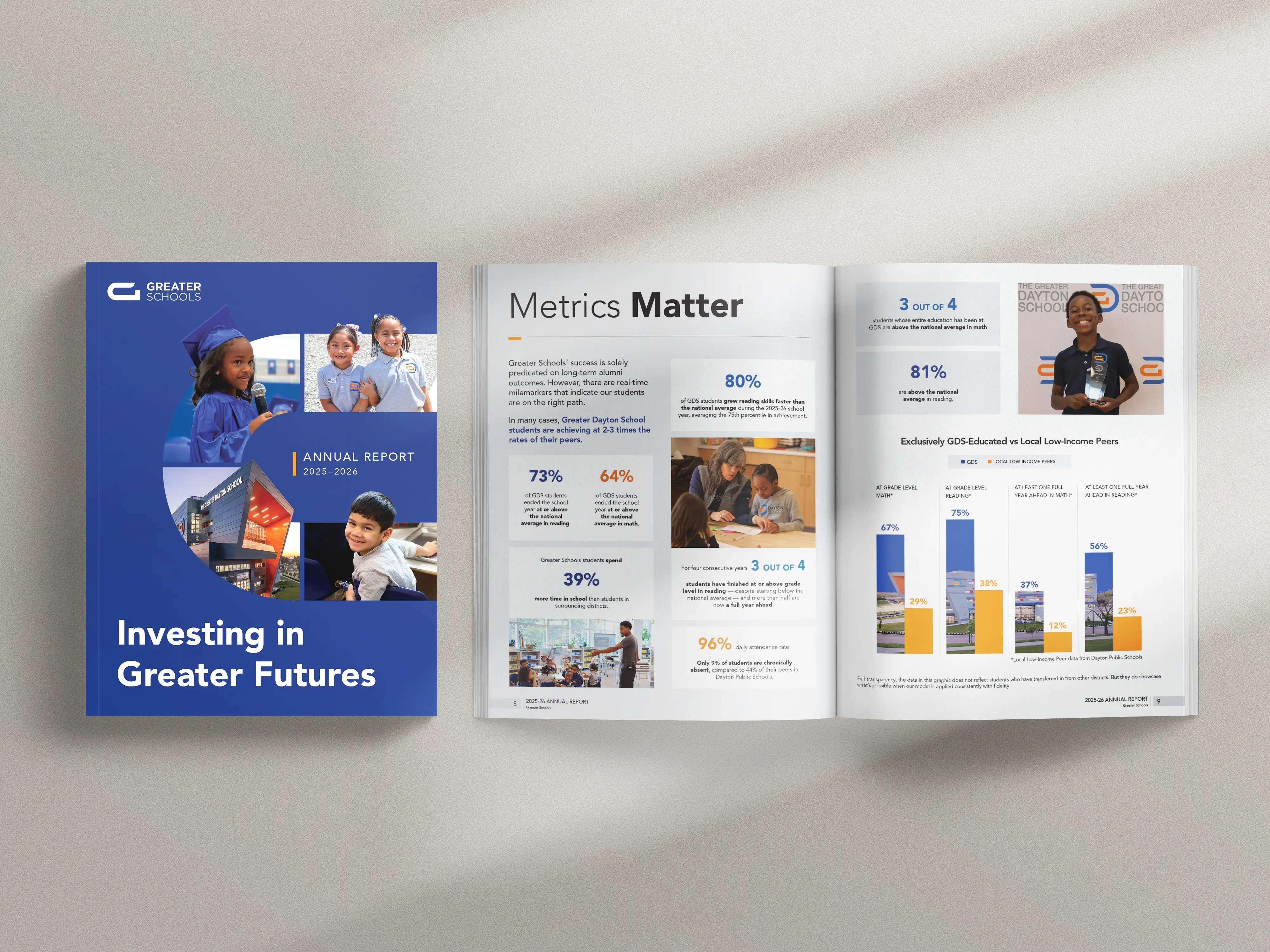
Greater Schools is raising $135 million to open a second campus. Here's how we designed a report and microsite that ask major donors to visit before a gift.
Client Case Studies
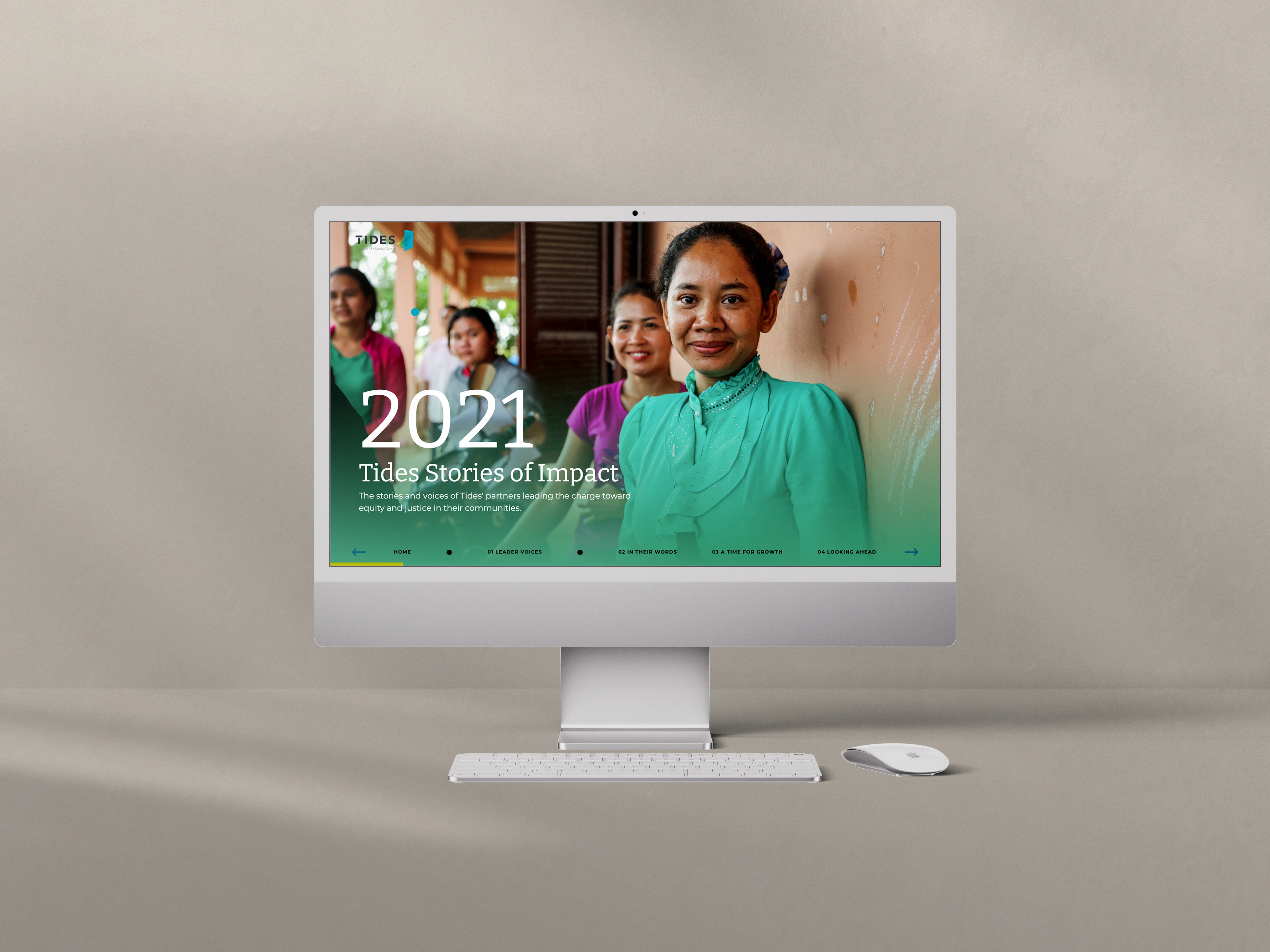
Tides wanted annual impact storytelling that lived online as an experience, not a PDF. Three microsites later, they have a digital language of their own.
Client Case Studies
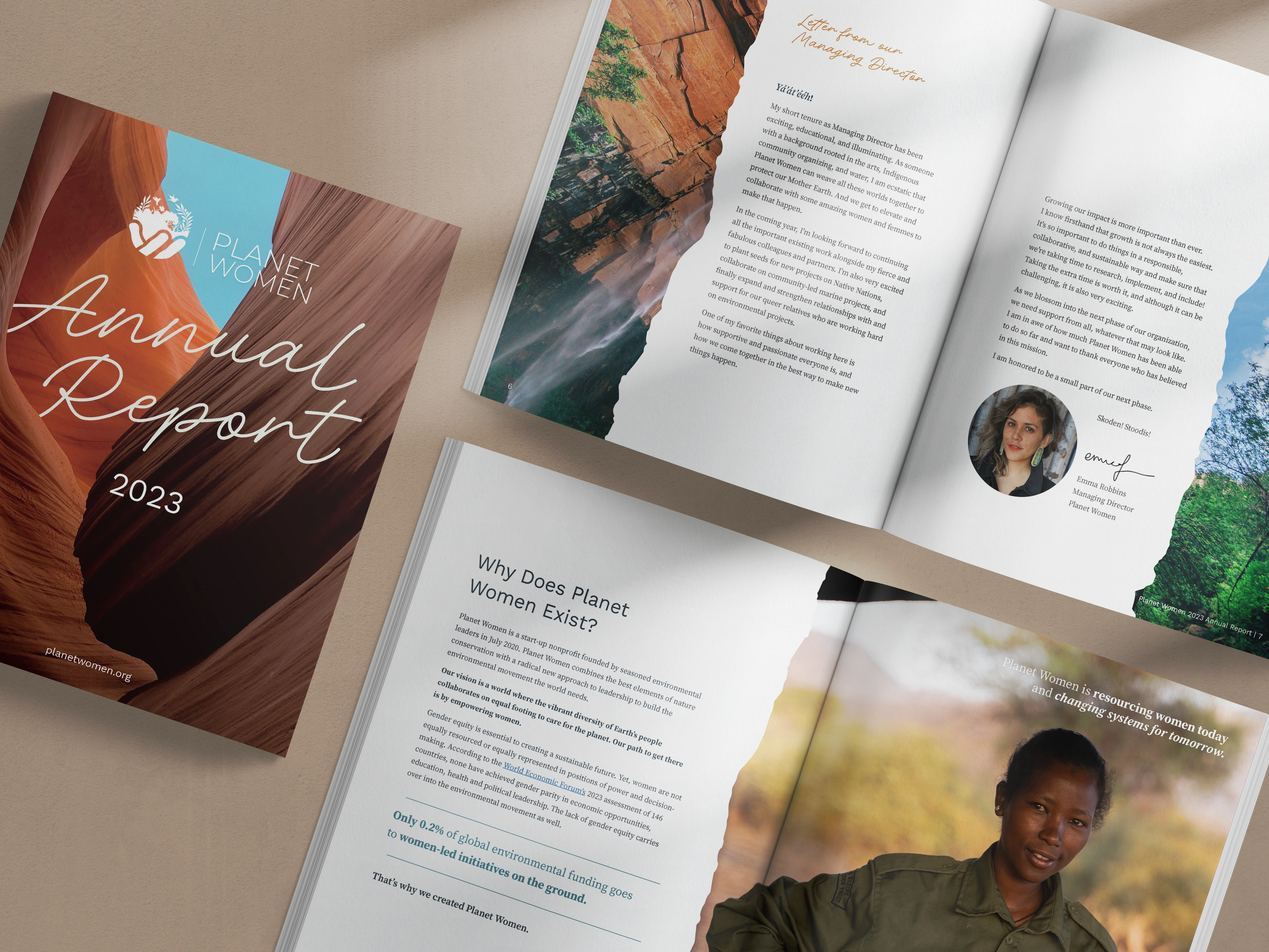
Planet Women needed a year-three report that matched their values and kept earning after launch week. Here is how it became a year-round asset.